Flux Design System
Flux is the name for the Meltwater Media Intelligence design system based on Google's Material Design system. As common features and patterns are identified, they get designed, coded and added. Once deployed to our app they are documented in our design system. We now have over 150 components in use in the app. These range from simple “atom” components like checkboxes and buttons to complex “organisms” like our content stream component. Every component exists as a design asset in Figma and as a component in the library that our engineers use for our platform. We also maintain a design system website that is used by Engineers, Product Managers and UX designers.
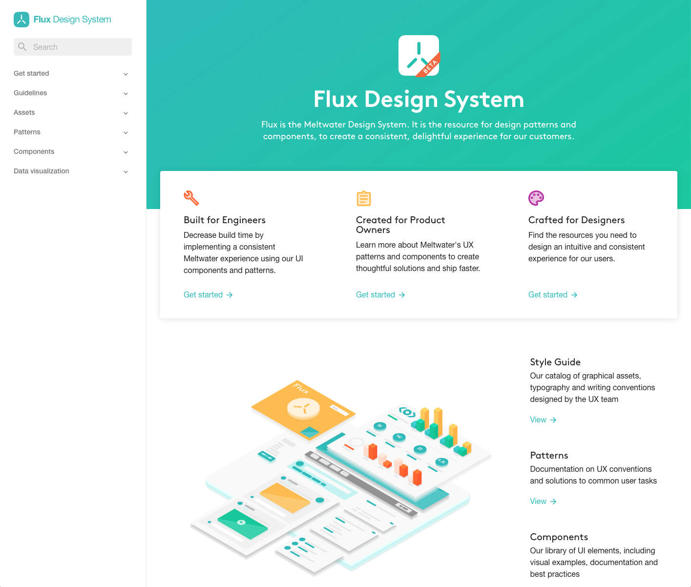
The homepage for our Flux Design System Website
Customizing Material Design
Although our initial button styles and form elements came directly from Google’s Material Design resources, almost every component has been customized to serve the specific use cases and UX needs of the Meltwater platform.

A typical component page, this one for content cards, a critical display element for our customers.
Data-Driven Components
The focus of this service is helping customers track their company and industry across news and social media. Accordingly, the content cards that represent that media are a critical part of our design system. These components are data driven. Content from our back end indicates the content type (news, Twitter, Youtube, etc.) and, based on that, display elements are turned on an off. It also enables specific trend data to be displayed such as engagement info for social media or reach data for editorial media.
Although the basic cards are similar across the app, the use cases vary and include reviewing coverage, curating content for newsletters and responding to social media posts. The content cards we designed vary in two ways. The first is by content type where the media type changes what metadata gets displayed. The other way is the display mode and information density. For basic news monitoring, our standard layout provides an open layout with lots of white space. Our social media engagement tool uses the compact setting which allows our users to scan more posts at once. Product teams can choose different display modes depending on where the content appears and the use case it is supporting.

Organisms… Content Plus Action
Content is then assembled into “content streams”, the news feed of our application. These include additional functionality like scroll behaviors, lazy loading as well as toolbars where users can take single and bulk actions on content.

The design system follows atomic design principles. Buttons, checkboxes and form elements are typical atoms. Our content cards are considered molecules, small assemblies of multiple atoms. Lastly, organisms are collections of different types of molecules. Our content stream is a corner stone of our application. A version of it exists in almost every tab in the app. The content stream is a scrollable container of content cards. It is capped with a toolbar and information like result counts and sort methods. The component is also a pattern with a series of small interaction details like scroll behavior, lazy loading and header elements that are sticky, then scroll off only return if the user starts to scroll back up.


Multi-step workflows are a common pattern in our app. The design of these is described in the patterns section of the Flux website.